OFFFORUM convenes a vibrant week of talks, exhibitions, and performances exploring design, art, and digital culture.
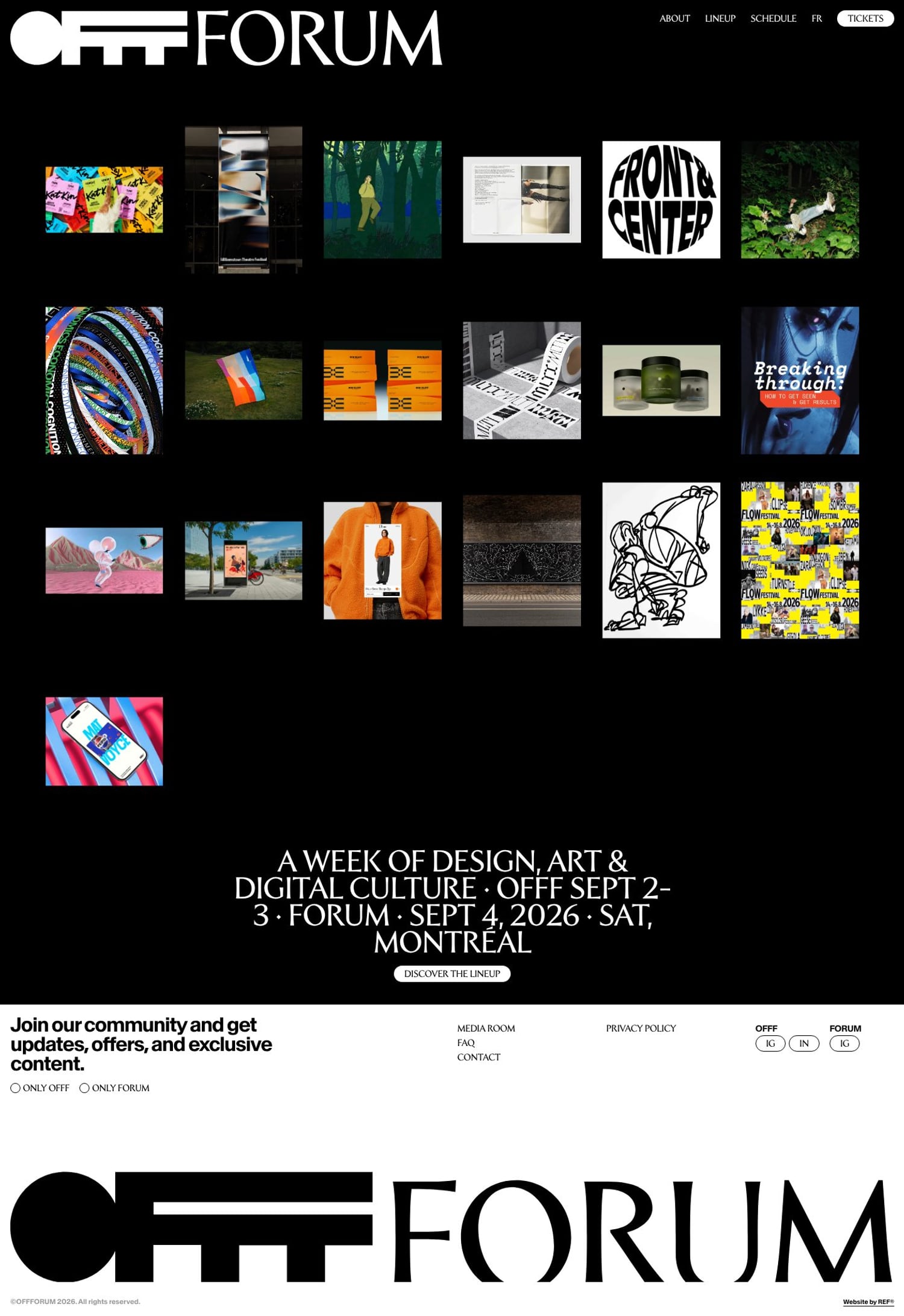
OFFFORUM approaches its landing page as a typographic system rather than a visual showcase. The palette is almost brutally restrained—black, white, charcoal, grey—offering no chromatic relief. What registers instead is texture and cadence, built from repeated navigation lines and stacked serif display type. The festival's full title, set in Forvm against a black field, reads like a broadsheet headline or an exhibition placard, while Baikal sans takes care of the interface labels with quiet, institutional coolness. The composition behaves less like a conventional homepage than a table of contents for a printed catalogue. The same cluster of links—About, Lineup, Schedule, Tickets—drums across the upper viewport as an oversized nav, turning a functional menu into a rhythmic typographic motif. This redundancy is deliberate: each repetition becomes an abstract stripe, and the central announcement is set in staggered serif lines so dense that the hierarchy feels sculptural rather than hierarchical. Generous black space around these blocks gives the layout the physical presence of a poster series. The art direction extends into the cookie overlay, which appears as an immaculate sheet of black and white with generous whitespace and starkly separated controls. There is no retreat into soft gradients or playful color; even an interruption is treated as part of the exhibition's visual language. The result is strangely static yet forceful: it feels less like a performing website than a printed catalogue that happens to respond to the cursor. In an era of animated landing pages, OFFFORUM's blunt typographic discipline is its most distinctive and reproducible idea.